21 Aug 2022


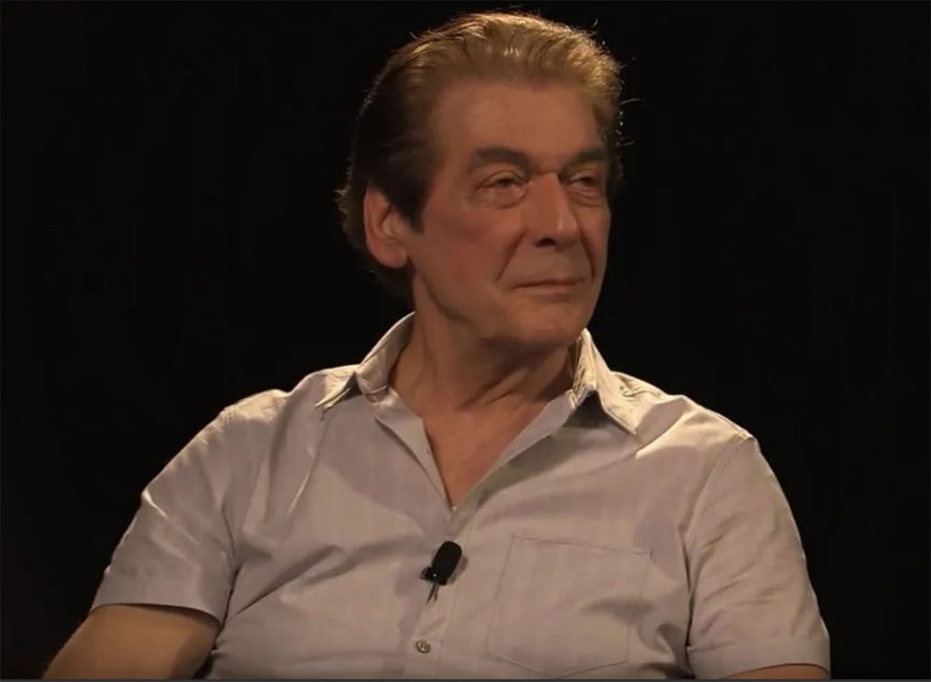
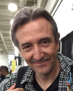
It is with great regret that the Inkwell Awards reports the passing of another of our “ink family.” Tom Palmer, long-time inker from the Silver Age to the present, has passed away at age 81. Tom was elected to the Inkwell Awards’ Joe Sinnott Hall Of Fame in 2014 [https://inkwellawards.com/tom-palmer/].

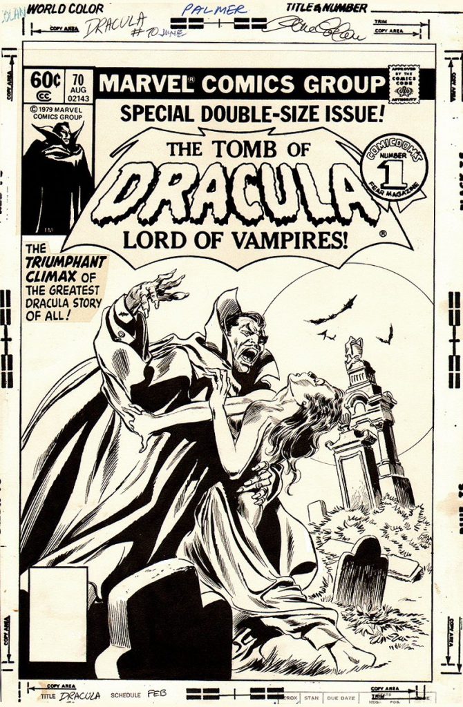
Tom was a legend—he’s on everyone’s list of best, favorite and/or greatest inkers. Most fans of penciller Gene Colan consider Tom to be Gene’s best inker. The two of them together set a standard for realistic and atmospheric fantasy art with their run on almost all 70 issues of Marvel’s Tomb Of Dracula beginning in the 1970s.


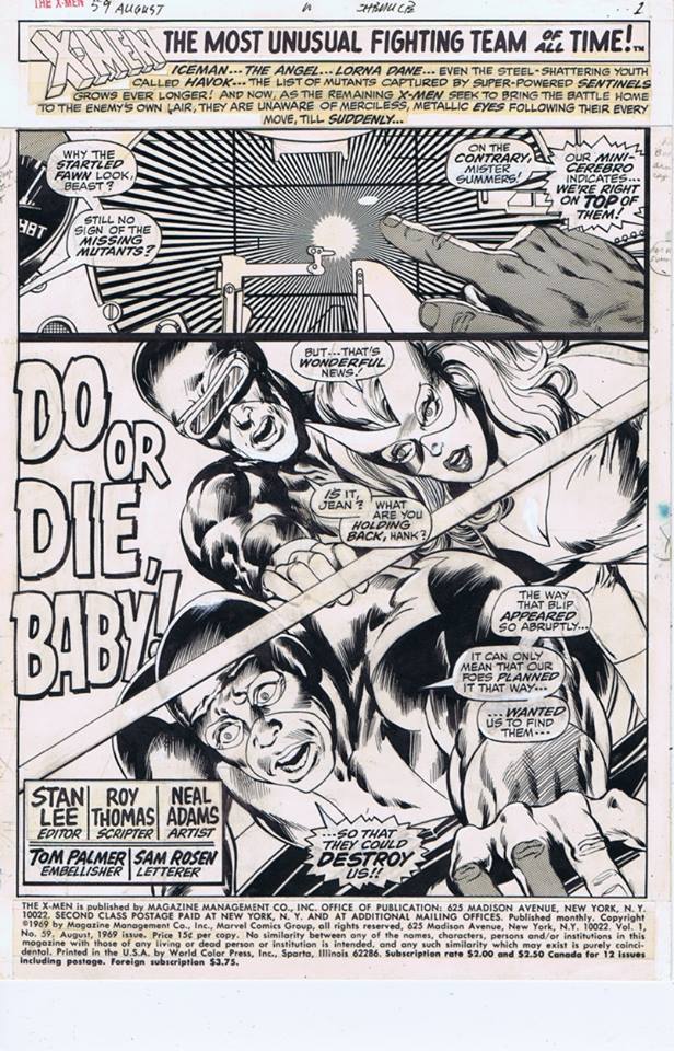
Tom brought a new dimension to anyone and everyone his pen and brush touched, including fellow legend Neal Adams in Marvel’s X-Men in the late ‘60s and the famous “Kree-Skull War” storyline in The Avengers during the Bronze Age. But his career spanned several decades and publishers, notably lending his talent and skill to DC’s flagship Batman character and Marvel’s and Dark Horse’s Star Wars titles, the latter done going into the early 21st century, when he finally retired. Not only was Palmer a legendary ink artist, he was also a gifted painter, and contributed a gorgeous oil painting used as the back cover to Aardwolf Publishing’s William Messner-Loebs Benefit Sketchbook, Heroes & Villains.


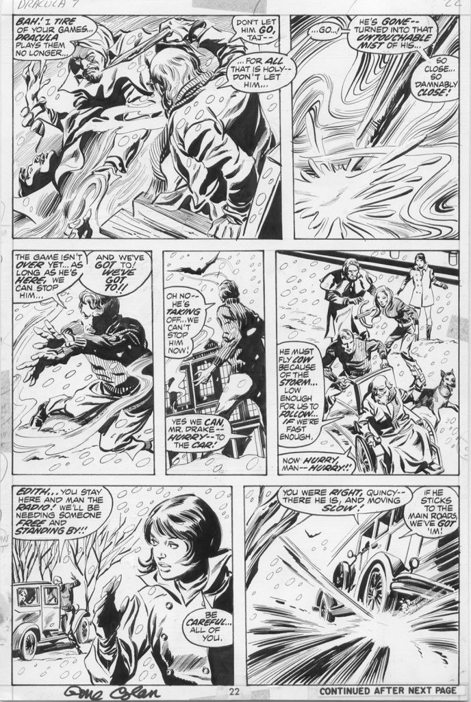
On a personal level, another connection to my childhood has gone to the great Comic Book Studio In The Sky. I was lucky enough to meet Tom at a San Diego Comic-Con many years ago, where he was gracious enough to sign the only original art I have of his, a page by my late friend Gene Colan and him from Tomb Of Dracula #7, of the first comics I received as a kid (thanks to fellow Gene pal and major fan, Tom Field).


He tended to be a private man who didn’t do many conventions yet was amicable and approachable in spite of the chaos of the con. Tom influenced a whole generation of inkers and his work will continue to influence, inspire, entertain and awe for as long as art endures.

The Inkwells convey our heartfelt sympathy to Tom’s family, friends, co-workers and many, many fans.

Article by Inkwell Awards’ Assistant Director Mike Pascale.

02 Jul 2020

(The following is but one article, part of a series about stages comic book production, this one on INKING, and other personal experiences that writer/colorist/former Marvel editor Gregory Wright has been posting on his Facebook account. It is amazing the amount of details he recalls going back decades. I would enthusiastically recommend reading all of his articles in this series if you are on Facebook and friends with him. This article was originally posted on 5/23/2020 and is being used with permission. It is TM & (c) 2020 Gregory Wright. Thanks, Greg!)

True tales of appreciation and condemnation of INKERS behind the lines of Marvel Comics…or any comic company really. Inkers. Inkers are frequently misunderstood. Fans don’t always know exactly what it is they really do. Pencillers blame them for not inking every detail exactly as they envisioned it. Editors will shift the blame for a book being late onto them. They will be labeled as TRACERS. They may be considered disposable, because they aren’t as “important” as the penciller. They will be labeled as HACKS because they frequently have to make up time on the schedule and spend days without sleep in order to get a book finished on time. Since they are able to deliver fast, they must be a hack, right? Some inkers employ assistants or background inkers. Some have a strong style, some are nearly invisible. The one thing they have in common is that they are under-appreciated.

There is a difference between an inker…and an artist who inks their own work. Let’s clarify that. Some pencillers do extremely tight pencils that they then also ink. Some pencillers do incredibly loose pencils and then proceed to do most of the drawing in ink. The end results can be quite different from having a separate inker. So as I am writing about inkers, I am referencing a separate person inking someone else pencils. Artists who ink their own work frequently produce their BEST work…it’s their work they way they really intend it to look. Some…are not their own best inker. They may think they are…but many fellow creators and fans will disagree and you can read all about those arguments elsewhere.

I love inkers. I love seeing talented inkers adding their own personal style to pencils and getting this brand new look, this collaboration that no single artist could get. The trick of course, is to not go too far. But occasionally…the penciller wants the inker to impose more of their style onto their pencils. One does not request Bill Sienkiewicz as an inker believing it will look like the very tight pencils that were handed to Bill. No. It will have distinct style added on top without redrawing the figures or the faces or anything that might be upsetting to the penciller. There are several inkers with styles that are so distinct that they might actually be preferred over the pencillers style. And sometimes…that is the point. Sometimes a penciller wants to shake up their work.

At times, an editor has a penciller that has a style that is too..old fashioned, or just seems dull…so the solution (instead of encouraging the penciller to do better or become more relevant) is to have the inker do all the work. Some inkers are happy to do it. Others are not interested in FIXING pencils that were not up to par. Some inkers think they know better than the penciller and take it upon themselves to “fix” various things they were not asked to do. This does not go well. Pencillers notice and complain. Editors will then sometimes fire the inker. Sometimes the inker gets blamed for doing this when they were TOLD to do it by the editor. And then they get fired anyway. Not fair. Nobody who wasn’t part of the process has any idea what really happened. But the inker will get blamed.

There are really two kinds of inkers. The first is what we simply call…the INKER. An inker puts an inked line on top of finished tight pencils. The definition of tight pencils will vary from penciller to penciller…some are so tight (John Byrne, Jack Kirby, Ron Frenz) that the pencils themselves could easily not be inked and used as they are. Sometimes the pencils are less tight…and the inker will have to make a lot more decisions regarding line weights and rendering style.

The second is called a FINISHER, or finishing inker. This inker is given pencils that are not…finished. There is usually no lighting, no indication of black, sketchy backgrounds and little detail. This inker is paid MORE to do this type of work. And not every inker is really great at doing finishing inks. Some inkers do their absolute BEST work as a finisher. The pencils for this inker are called breakdowns. All breakdowns are not considered equal. Some are very loose…but everything you need to do a great job structure wise is there. John Buscema is the one artist who provided loose breakdowns that most talented finishing inked loved to work over and would say…everything they needed was there. Others would try to do the minimal amount that Buscema would provide and fail. Some would provide breakdowns that were pretty tight and neat…just without lighting and indications of black. Sometimes I’ve seen breakdowns that were closer to full pencils. I’ve also seen full pencils that were closer to breakdowns. There were occasions where a penciller claimed to be doing full pencils and the inker felt they were more like breakdowns and we’d have to have John Romita Sr. decide. It wasn’t always pretty…

(more…)

17 Mar 2020

One of the last veteran creators from comicdom’s Golden-age, Allen Bellman, passed away March 9, 2020 at 95. His career and legacy from the start had it’s roots in Timely Comics (now Marvel) history where he penciled and inked throughout the 1940’s and early 1950’s at the Timely-renamed Atlas Comics and at Lev Gleason. Senior Inkwell Contributor Steven Freivogel, Allen’s agent, webmaster and fellow Floridian neighbor, wanted to honor his good friend by sharing some memories in the tribute below. We at the Inkwell express our sincere condolences to Allen’s wife Roz and all their loved ones. Bob

What can be said about a man who was kind and caring to not only myself and my family but many lives and people he came across and touched?

Allen’s life story began when he started working for his parents’ bakery shop in Manhattan. Being very much into art and cartoon strips, Allen studied at the High School of Industrial Arts. He saw an ad and almost missed his chance to work at Timely Comics but his father told him to go. He started out doing backgrounds (and “junk work” as he stated) as a teenager for Syd Shores but became a full time staff member working with Gene Colan, Syd Shores, Sol Brodsky and even Stan Lee as well as many titles including Captain America Comics, The Human Torch, The Sub -Mariner. He also self-created his back-up crime feature “Let’s Play Detective”.

His stories included not only Timely Comics , of which he recounted with superb memory, but seeing Jackie Robinson play, buying the firstAction Comicscomic book, having his artwork stolen out of his car (he stated “who knew?” as they just either threw it away or kept the art in odd places), his family life and New York.

He eventually left comics stating that he never could remember why, started and sold a business and, with his first marriage behind him, he did meet his “Wonder Woman” and true love Roselyn and they were married for 57 years as of April 15, 2019.
They moved to South Florida and Allen took up photography and joined the art department for the Sun Sentinel.

The first time I met him was through my wife who was an editor on a story about him. Joyce stated – “Do you want to meet a comic book artist I know in Tamarac?” I did not know much about him or his history but was intrigued. She called him and we came over to meet him and Roz. I still remember that first time coming to his place with my Captain America comic books and just sitting and listening to his stories. After meeting him that first time, we spoke a few more times. I then offered to help get him back out there and make his name more mainstream. It started with a few public appearances (the first was Florida Supercon with promoter Mike Broder) and it grew and grew and grew to twelve plus years to where I had Allen attending conventions, having a full-fledged website, signings and finally getting the recognition he deserved so very much.

We met many, many times and spoke many, many times. He and Roz were also there from the beginning even when my daughter was born. They were truly and always great, supportive friends.

Like Dr Seuss said, “The stories I could tell…” as there were too many great ones to count but a joy each and every time to ask and hear about them.

I continued to help Allen and Roz in what they may have needed for booking conventions (later on with Kathy Gummere’s help and much needed knowledge from Dr. Michael Vassallo, Terry Cronin, Stan Lee, Jackie Estrada, Nancy Shores, Joe Goulart and Michael Uslan), to Allen’s website to even changing the light bulbs in their place. Allen and Roz’s kindness and connections were also evident with other people the Bellmans came across including Claudia Wells, Bob Layton, the Delbos, George Moss, Reb Brown, Bruce Macintosh, Allen Stewart, Chip Cronkite, Mike Zeck, Tate Ottati, Andrew Satterfield, Danny Fingeroth, Roy Thomas, Joe Staton, Joe and Mark Sinnott, Mark Hodges and the Simons (if I forgot anyone, I apologize).  I also consider myself lucky to have had the first-hand experience and knowledge to visit weekly and speak to Allen almost everyday, not just about Timely but about life in general.

No few words can sum up what Allen Bellman has done for not only Timely, the Navy (did you know he painted the logos on the planes?) and my family. With his lovely wife Roz by his side, he was solid and true to the end.

For Captain America comics and the world, we have now lost the last piece to a great puzzle of history.

I will miss you, my dear friend.

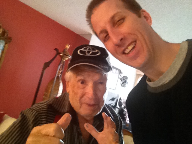
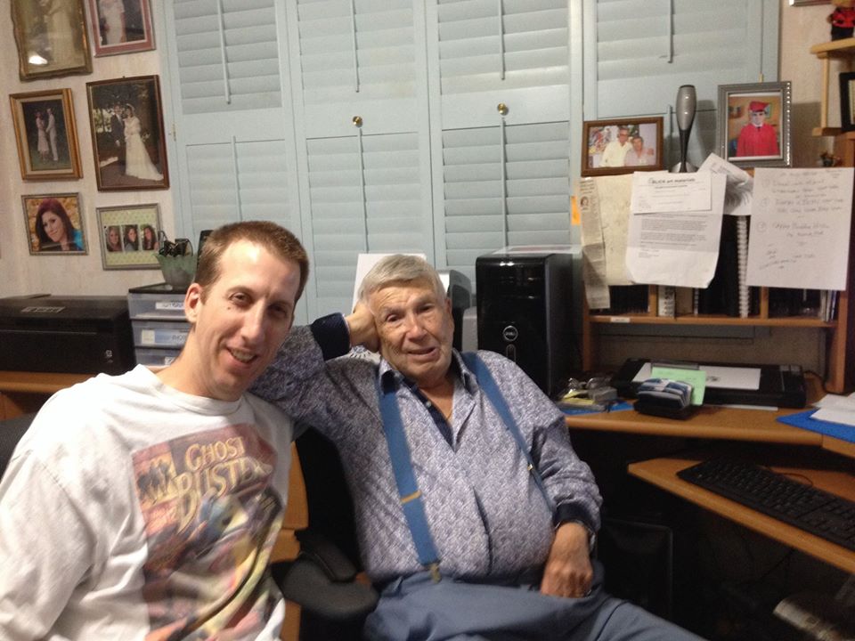
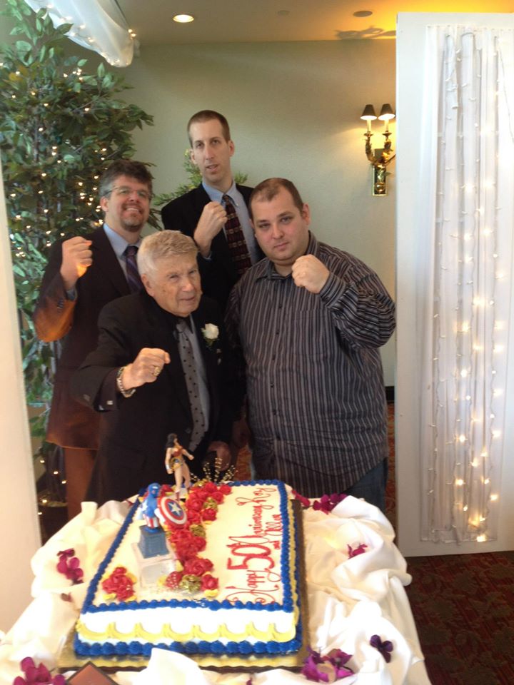
(L-R, back row) Terry Cronin, Steven Freivogel (L-R, front row) Allen Bellman, Mike Broder to celebrate the Bellman’s wedding anniversary

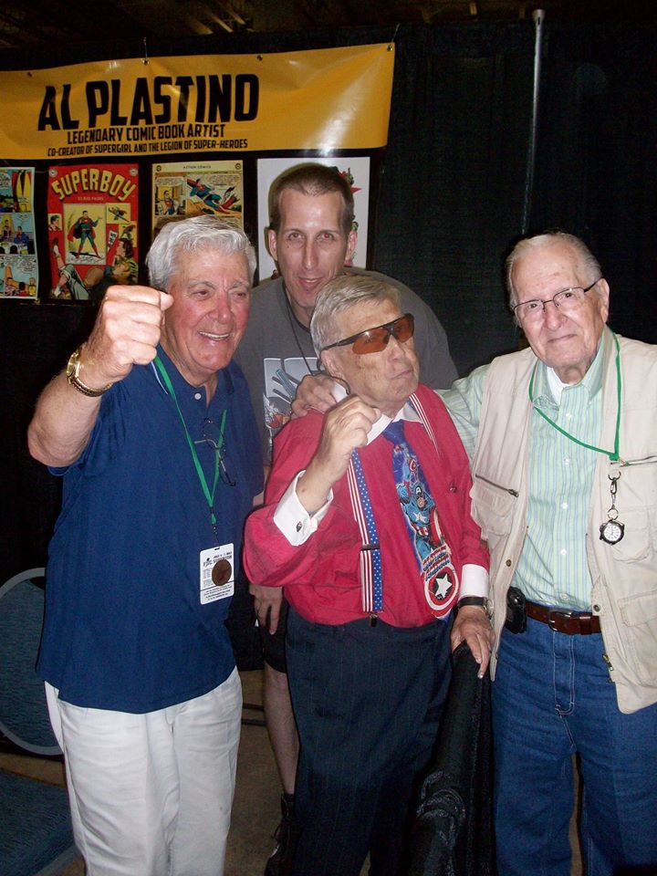
(Back) Steven Freivogel (Front, L-R) Al Plastino, Allen Bellman and Nick Cardy at the 2013 Florida Supercon


14 Jan 2017

A wonderful article from Dan Panosian’s Facebook wall yesterday Friday January 13 on the various essential aspects of inking. He’s a master of the art form and, as a contributor since the Inkwell Awards launched in 2008, has even graciously designed our Inkwell Awards logo!  We print the article here with Dan’s permission. Bob

There’s been a lot of discussion about inking lately among professionals. The vast majority of my early career was spent inking. Lots of inking. Inking, for those that aren’t familiar with the term is the black line work aspect of the art before it’s colored. Sometimes Inkers are called Tracers. It makes sense, in many cases the pencils they’re inking are so finished looking that they may not really require inking. But in some cases, an Inker is adding finesse to the drawing. Fixing little mistakes or adding texture. The role of the Inker varies from project to project. And like all professions, some are better at it than others. But there are some fundamentals that are essential to comic book inking.

Inking and line art drawing is basically using lines and in some cases, tones, to replicate Light and Shadow for 2D purposes. Understanding that alone is the perhaps the most important aspect of both drawing and especially inking. Using lines to visually inform the viewer of how light is affecting an object. Or, how it isn’t – in the case of shadows. Simple, right? You would be surprised how often that sort of thinking is abandoned, particularly in the comic book art-form. Even with professionals.
At times, artists forget that very important concept for the sake of artistic expression and call it Style. Style is key in the art world. It separates one talent from another. A well crafted style of drawing or inking becomes, in a sense, much like a signature. It’s what separates us and makes our artistic expression unique. It’s why you like one artist and not another. A style either appeals to you or it doesn’t. Regardless of whether or not a style appeals to you – it’s key that the style adheres to the same rules of nature and what we relate to everyday when we open our eyes. The Principles of Light and Shadow.

So a style can be fancy or it can be bare. It can flourish and it can even occasionally break rules. But unless, you’ve first mastered drawing, like say – Picasso, breaking the rules for the sake of style is a big mistake. It’s not “telling the story” with ink. Drawings are the tools of visual storytellers. If your drawings convey your story – you’re a successful storyteller no matter what the style. But if your style interferes with the story flow- you’re failing. An illustrator can be extremely detailed or extremely bare-bones in their approach but the objective should always be story. That goes for inking as well. If the inking is off, that can affect the reader’s attention. Their eyes try to correct or make sense of what they’re seeing. That is a determent to story and unless it’s intentional -should be avoided.

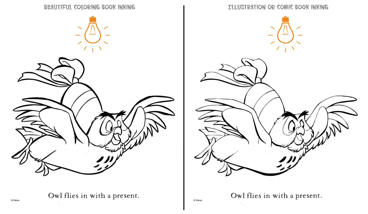
To demonstrate the most simple and most powerful aspects of inking I’ve used this beautiful Winnie the Pooh coloring book illustration as an example. Years ago, Dick Giordano gave me the most important inking advice of my career. He said to always imagine a light bulb at some point/place in the drawing. If the light shines from the top of the page that means every object with a top and bottom line [ like a cylinder ] is affected. The top line is light and naturally the bottom line is heavier. Suddenly, the object [ cylinder ] has the illusion of real solidity and weight. If both lines are the same line weight, it’s harder to demonstrate weight. It’s a simple concept.
Of course there are examples of single line weight illustration. But if an inker is employing varying line weights and the Principle of Light and Shadow is messed with – things can be confusing. It won’t make as much visual sense. If an inker just likes using a bouncing line weight because it looks pretty – it will lack sophistication. Comic books and sophistication? It’s possible!
So in the example below – note that even the tops and bottoms of feathers employ the same well executed line weights. But let’s remember it’s for a coloring book. There’s nothing wrong with that. But for a comic book, that sort of flourish misinforms the viewer. Style overrides substance. Style is important but it should never distract from story.

Another quick note. Many inkers freeze up on faces. Suddenly they pay more attention and forget that the bottom of a nose has weight – not quite as much as a chin – but it extends outward and creates a shadow. And thus- a heavier line is required to properly illustrate that. The same with the eyebrows. They extend over the the eyes. Our eye lashes have a natural “black” line to them. So the top of the eye should be pronounced. It will make the eyes pop more. Just like they do on our faces in real life. Hair has shadows too. It clumps, it waves. The top of the hair should be light and the bottom should be heavier – just like other objects.
For that matter, notice the trim lines on the “egg” or whatever that object is that the owl is carrying. Some lines are simply there to illustrate a change in color. Similar to the lines encircling Owl’s eyes. They don’t have weight. The should simply denote a change in color – not depth.
Anyway, stuff to think about.

23 Feb 2016

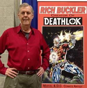
Upon accepting the position of Inkwell ambassador as reported last month Rich Buckler graciously offered the non-profit organization to share this new, fascinating material on his thoughts on the art form of inking and his career experiences with it. Rich is an accomplished teacher on sequential art storytelling and master of many of the necessary skills involved in comic book production including INKING.  He has had several comic How-To books published in ’80s-’90s on these crafts.

Thanks, Rich!

~B~

RichBucklerBioPic200

Inking As Drawing…

©2015 Rich Buckler

Most comic book art is a collaboration of a pencil artist and an ink artist. Two artists who produce, in separate stages, the finished art that (after being lettered and colored) goes to the printer. So really, every printed page has actually been drawn twice.

Most comics fans do not have a good understanding of that creative process and what that involves. Misunderstanding what an inker does can can cause all sorts of distorted ideas. Comic book pencillers have all sorts of ideas about inking. Some think inkers are only tracers (which is not accurate) or, at best they are a necessary evil (which is very inaccurate). Sometimes the inker gets too much credit for the look of the final art–sometimes, not enough.

I see the penciller/inker collaboration as a team effort. Inkers are artists. And every team effort of pencillers and inkers on a comic book is almost always a compromise.

There are no “super inkers” who make every penciller look great no matter whose art they ink (I wish there were!). That is just a gross exaggeration. Some combinations do work better than others. Generally inkers do a judicious amount of embellishing and make “improvements”–but not all of them do this. And nobody is perfect.
So let’s take a look at what inkers do.

The inker is responsible for the final look of the art–to make it as sharp and attractive for reproduction as possible. In that sense, they do correct things as they work. For example, a stray line, a missed detail, or some appropriate added black areas here and there–things like that. Pencillers who ink their own work do this too.

Nobody even attempts to duplicate exactly all of the subtleties and nuances of the pencil work. That is not only not desirable, it is practically impossible. What the inker is expected to do is faithfully render the drawings effectively in ink. He/she is expected to know good draftsmanship but not expected to redraw what has already been drawn.

Which is not to say that that doesn’t involve drawing; of course it does! So, ideally, every professional inker should have a good grasp of the basics of drawing. Why is that essential? When the inker comes on board everything has already been drawn, right?

Well, consider this: A good professional inker will never merely trace pencil lines with a pen and brush. That’s not inking; it’s just tracing. Trust me, that approach is amateurish and only produces mediocre results. A really substandard inker (one who is not competent or whose drawing skills are not up to professional standards, that is) may get work, but not for long–and certainly not on a regular basis! Okay, in the comics a few bad inking jobs may happen. (And it’s a wonder that there are not more!) But that almost never occurs on a top book. And I don’t know of a single instance where a totally inept artist was ever afforded the opportunity to make a career out of it.

(more…)

06 Mar 2012

Guest column by ink artist Phyllis Novin

Phyllis Novin here. A quick word of thanks to Bob for letting me shamelessly plug my inking class at MoCCA NYC on his nifty website.

I’m teaching four, 2 hour classes on inking 3/28, 4/4, 4/18 & 4/25.

This is a hands-on inking course designed for those new to comic book inking as well as for those who want to expand their basic inking skills.  While primarily brush-orientated, you will also be working with crow quill pens and other tools both rational and irrational.  You will not only learn inking techniques but get an understanding of the basic framework behind inking.  You will know what you need to do on a page and why.

(more…)