- BY inkdev
- POSTED IN Guest article
- WITH 0 COMMENTS
- PERMALINK
- STANDARD POST TYPE


A wonderful article from Dan Panosian’s Facebook wall yesterday Friday January 13 on the various essential aspects of inking. He’s a master of the art form and, as a contributor since the Inkwell Awards launched in 2008, has even graciously designed our Inkwell Awards logo! We print the article here with Dan’s permission. Bob

There’s been a lot of discussion about inking lately among professionals. The vast majority of my early career was spent inking. Lots of inking. Inking, for those that aren’t familiar with the term is the black line work aspect of the art before it’s colored. Sometimes Inkers are called Tracers. It makes sense, in many cases the pencils they’re inking are so finished looking that they may not really require inking. But in some cases, an Inker is adding finesse to the drawing. Fixing little mistakes or adding texture. The role of the Inker varies from project to project. And like all professions, some are better at it than others. But there are some fundamentals that are essential to comic book inking.
Inking and line art drawing is basically using lines and in some cases, tones, to replicate Light and Shadow for 2D purposes. Understanding that alone is the perhaps the most important aspect of both drawing and especially inking. Using lines to visually inform the viewer of how light is affecting an object. Or, how it isn’t – in the case of shadows. Simple, right? You would be surprised how often that sort of thinking is abandoned, particularly in the comic book art-form. Even with professionals.
At times, artists forget that very important concept for the sake of artistic expression and call it Style. Style is key in the art world. It separates one talent from another. A well crafted style of drawing or inking becomes, in a sense, much like a signature. It’s what separates us and makes our artistic expression unique. It’s why you like one artist and not another. A style either appeals to you or it doesn’t. Regardless of whether or not a style appeals to you – it’s key that the style adheres to the same rules of nature and what we relate to everyday when we open our eyes. The Principles of Light and Shadow.
So a style can be fancy or it can be bare. It can flourish and it can even occasionally break rules. But unless, you’ve first mastered drawing, like say – Picasso, breaking the rules for the sake of style is a big mistake. It’s not “telling the story” with ink. Drawings are the tools of visual storytellers. If your drawings convey your story – you’re a successful storyteller no matter what the style. But if your style interferes with the story flow- you’re failing. An illustrator can be extremely detailed or extremely bare-bones in their approach but the objective should always be story. That goes for inking as well. If the inking is off, that can affect the reader’s attention. Their eyes try to correct or make sense of what they’re seeing. That is a determent to story and unless it’s intentional -should be avoided.
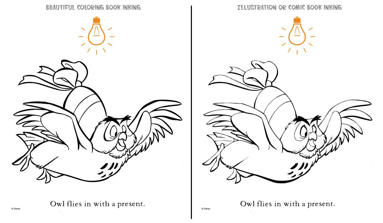
To demonstrate the most simple and most powerful aspects of inking I’ve used this beautiful Winnie the Pooh coloring book illustration as an example. Years ago, Dick Giordano gave me the most important inking advice of my career. He said to always imagine a light bulb at some point/place in the drawing. If the light shines from the top of the page that means every object with a top and bottom line [ like a cylinder ] is affected. The top line is light and naturally the bottom line is heavier. Suddenly, the object [ cylinder ] has the illusion of real solidity and weight. If both lines are the same line weight, it’s harder to demonstrate weight. It’s a simple concept.
Of course there are examples of single line weight illustration. But if an inker is employing varying line weights and the Principle of Light and Shadow is messed with – things can be confusing. It won’t make as much visual sense. If an inker just likes using a bouncing line weight because it looks pretty – it will lack sophistication. Comic books and sophistication? It’s possible!
So in the example below – note that even the tops and bottoms of feathers employ the same well executed line weights. But let’s remember it’s for a coloring book. There’s nothing wrong with that. But for a comic book, that sort of flourish misinforms the viewer. Style overrides substance. Style is important but it should never distract from story.
Another quick note. Many inkers freeze up on faces. Suddenly they pay more attention and forget that the bottom of a nose has weight – not quite as much as a chin – but it extends outward and creates a shadow. And thus- a heavier line is required to properly illustrate that. The same with the eyebrows. They extend over the the eyes. Our eye lashes have a natural “black” line to them. So the top of the eye should be pronounced. It will make the eyes pop more. Just like they do on our faces in real life. Hair has shadows too. It clumps, it waves. The top of the hair should be light and the bottom should be heavier – just like other objects.
For that matter, notice the trim lines on the “egg” or whatever that object is that the owl is carrying. Some lines are simply there to illustrate a change in color. Similar to the lines encircling Owl’s eyes. They don’t have weight. The should simply denote a change in color – not depth.
Anyway, stuff to think about.
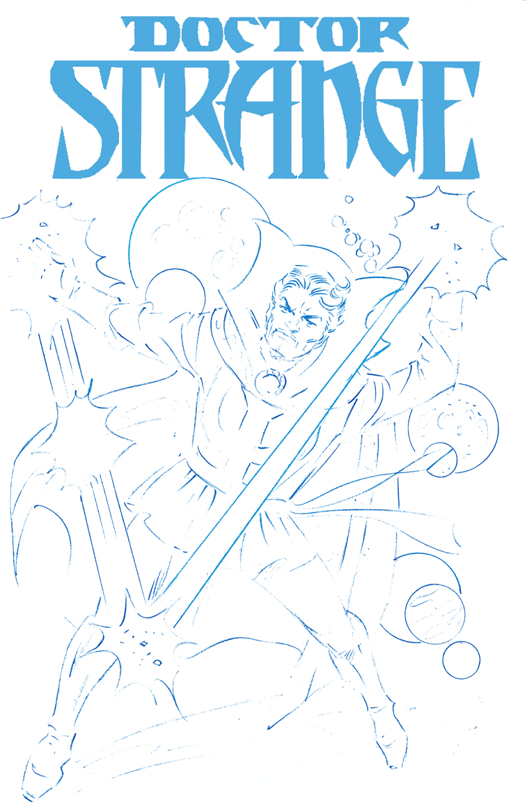
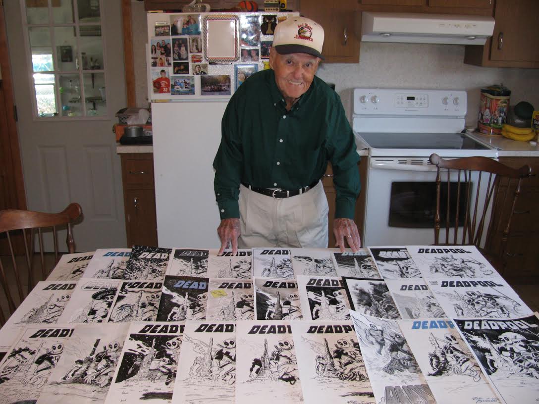
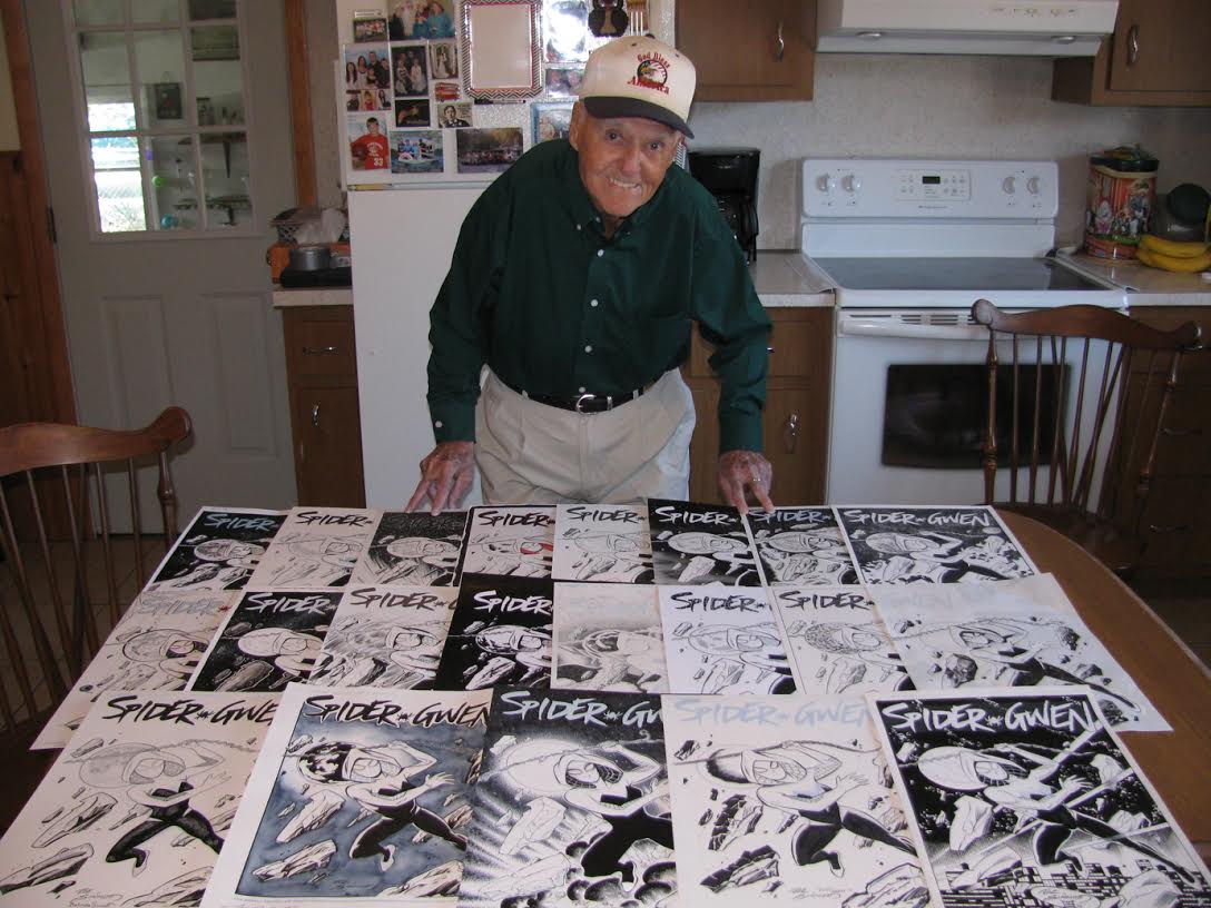
 in over $3000 on our eBay auctions and this year we anticipate an even better outcome. You can see previous samples of donations from our first five years at our
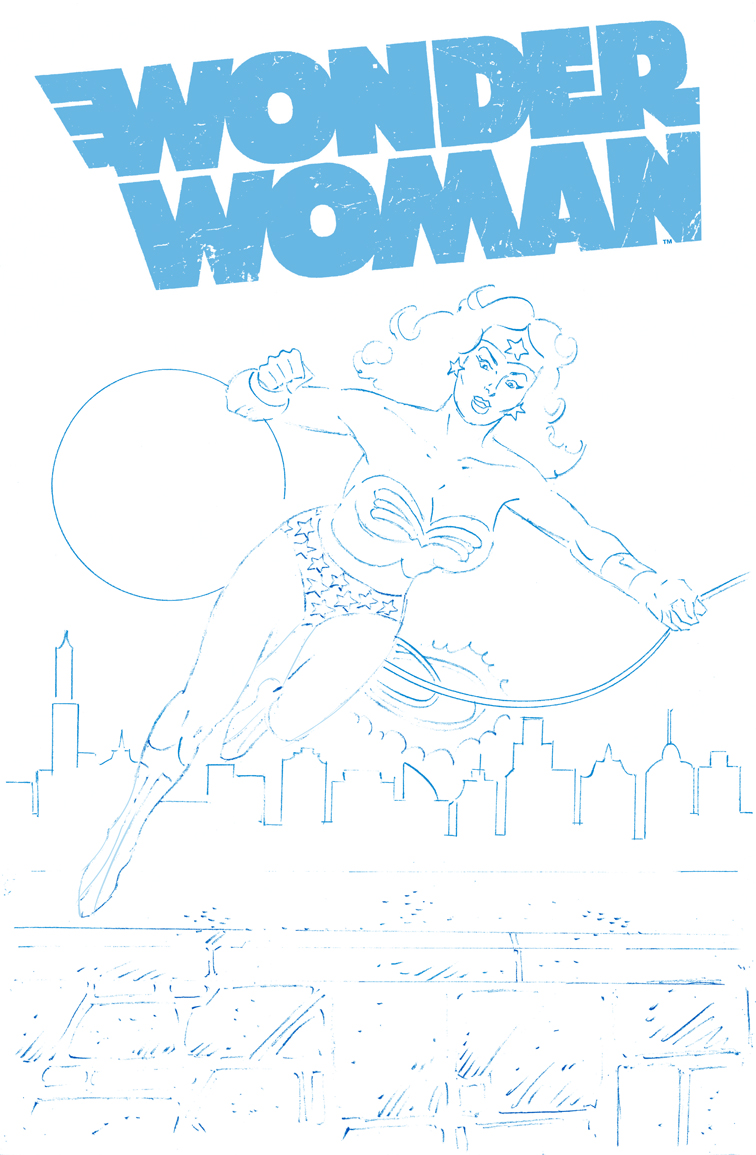